
Case Study - Healthcare
My role: Experience Design Consultant
Industry: Healthcare
Client: Private Equity Backed Startup in NYC
The CTO of a startup healthcare company reached out with concerns about their unreleased mobile app, which had an AI component planned for the overall care model. To start, the company focused on supporting individuals with chronic diseases. Throughout the project, I was able to find opportunities to balance the patient’s time spent in the app with the valuable offerings of the proprietary treatment plan, ensuring that users would feel understood and be willing to trust the company.
Situation:
The contract scope focused on the redesign of an existing app design, aiming to better support individuals managing chronic diseases. The initial app lacked user-centered design and failed to address the unique challenges faced by people living with chronic conditions. I recognized the significance of creating a solution that could be effective in shorter spurts of time.
Task:
My primary task was to streamline the app’s registration and login experience, so that we could get enough adoption to prove the value of the treatment plan. I knew we needed to cut back registration to only the most necessary parts. It was obvious to me that sick people wouldn’t spend a lot of time with an app they couldn’t be sure would make them feel better. Time was of the essence.
Actions:
I conducted comprehensive user research, engaging with individuals living with chronic diseases to gain deep insights into their daily challenges. This involved in-person interviews, focus groups, and ethnographic research to understand the specific pain points, frustrations, and unmet needs of the target user group.
Through user research, I identified several key problem areas faced by people with chronic diseases. Examples included medication adherence, symptom tracking, accessing reliable information, emotional support, and connecting with a supportive community. These insights formed the foundation for the app's redesign.
Using the identified problem areas, I developed iterative prototypes of the redesigned app. They engaged users with chronic diseases to participate in usability testing, seeking their feedback and insights. This iterative process allowed for continuous refinement and optimization based on real user experiences and preferences, with special attention paid to the language of these patients to show that the product understood the experience.
I integrated personalization and customization features into the app. This allowed users to tailor their experience based on their specific condition, symptoms, treatment plans, and preferences. However, we took the time to find intuitive moments to offer these options instead of jamming it all into registration. The app provided relevant and targeted content, reminders, and resources, ensuring a personalized journey for each user.
The biggest challenge was in the process of designing features that helped these patients manage their conditions. Examples included medication reminders, symptom tracking and analysis, virtual consultations with healthcare professionals, peer support groups, educational resources, and goal-setting tools. These features aimed to foster self-care, improve disease management, and enhance overall well-being. Timing turned out to be a huge lever so I mapped these features to relevant milestones, demonstrating intelligence and support.
Results:
The redesigned app provided a user-centered solution by addressing real problems faced by individuals with chronic diseases in the right moments using the right data. By incorporating their needs, preferences, and pain points, the app has the potential to become an effective tool for managing conditions and improving quality of life. The app's intuitive logic, personalized features, and simplified tools contributed to better disease management. Users could track their symptoms, manage medications, access reliable information, engage with healthcare professionals, and connect with a supportive community. We also supported users in turning features off, declining support at times, and honoring the patient’s sense of agency and their resilience.
Following the app's launch, the company went public on the London Stock Exchange exceeding expectations and attracting partnership with some major names in healthcare.

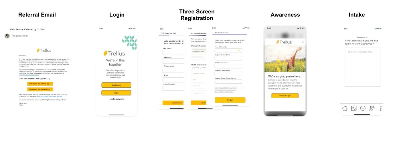
OnBoarding Flow on Mobile
The redesigned onboarding flow, broken out into smaller steps to be more considerate of the patient’s limited time and frustration with redundant questions
Defining an Approach to Design Accessibility
The new information architecture to support a bigger picture look at the new design

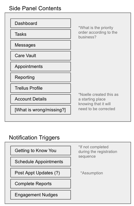
Information Architecture on Mobile
The company did not have any definitions previously and as a consulting designer, I needed to articulate some norms for the product team to use
